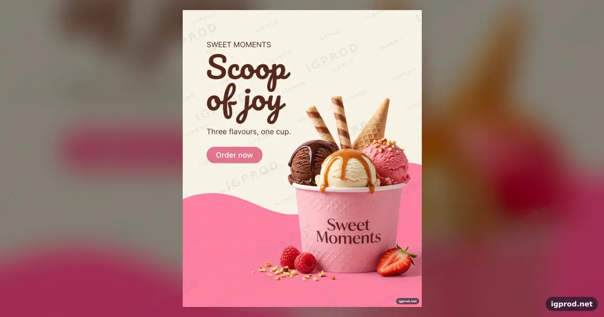
This ice cream cup ad image prompt makes a vertical, photorealistic poster for a fictional brand: three scoops in a pink cup, with a headline and order button beside it. It suits product and marketing images where the dessert needs to carry the composition while the copy stays visible. The recorded result follows that layout, though it also contains unwanted marks.
What the ice cream cup ad produced
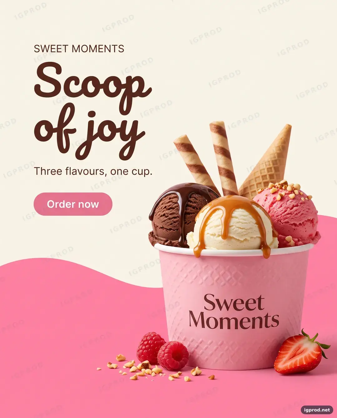
In the recorded Gemini (Nano Banana) result, the vertical image follows the cream and pink wavy layout, places the labeled three-scoop cup beside the requested text and button, and includes the specified toppings and fruit. Bright, soft light gives the dessert glossy textures. The image spells “SWEET MOMENTS,” “Scoop of joy,” “Three flavours, one cup.”, “Order now,” and “Sweet Moments” on the cup. [run]
Repeated “IGPROD” watermarks and an “igprod.net” mark also appear, despite the request to avoid real brand logos. This result is unsuitable as a finished ad until those marks are resolved; the recorded evidence does not establish rights to use the marked image. The result shows no people, phone interface, melted mess, or extra cups. [run]
Why the ice cream cup prompt is structured this way
The opening fixes the canvas and format with “photorealistic” and “vertical 4:5 (1080x1350).” The “cream off-white upper half” and “vibrant pink lower half” establish two areas, while “joined by a smooth wave” specifies their boundary. That gives the product and copy distinct places in the composition. [run]
The subject instruction puts the cup on the “right side” and counts “three scoops” and “two wafer rolls.” Naming each flavour, topping, and fruit makes the requested arrangement specific enough to inspect in the result. [run]
“Bright soft daylight” and “glossy creamy textures” define the finish. The left-side typography instruction supplies exact text for the label, headline, short line, and button, so you can check each phrase rather than judge the copy by appearance alone. The “Avoid” line lists people, a phone interface, real brand logos, melted mess, and extra cups; the unwanted marks show the limit of that instruction in this run. [run]
Ice cream cup ad prompt ready to copy
Create a photorealistic ice cream ad, vertical 4:5 (1080x1350), for a fictional brand "SWEET MOMENTS".
Layout: cream off-white upper half, vibrant pink lower half, joined by a smooth wave.
Subject (right side): a pink embossed paper cup labeled "Sweet Moments" holding three scoops: chocolate, vanilla,
strawberry. Chocolate sauce dripping on the chocolate scoop, caramel on the vanilla, crushed nuts, two wafer rolls
and a waffle cone tip behind the scoops, fresh raspberries and a sliced strawberry at the base.
Typography (left side): small "SWEET MOMENTS" label, a large handwritten-style headline "Scoop of joy", a short line
"Three flavours, one cup." and a rounded pink button reading "Order now".
Lighting: bright soft daylight, glossy creamy textures.
Avoid: people, phone interface, real brand logos, melted mess, extra cups.
Three ways to vary the ice cream cup ad
For a cooler palette, change “vibrant pink lower half” to “pale blue lower half” and “rounded pink button” to “rounded blue button.” That shifts the background and call to action together while keeping the same cup composition.
For a simpler product image, change “three scoops: chocolate, vanilla, strawberry” to “one vanilla scoop” and remove the words “Chocolate sauce dripping on the chocolate scoop, caramel on the vanilla, crushed nuts, two wafer rolls and a waffle cone tip behind the scoops, fresh raspberries and a sliced strawberry at the base.” Change “Three flavours, one cup.” to “One scoop, one cup.” The intended look has one scoop, fewer competing details, and copy that matches the product.
For a different campaign line, change “Scoop of joy” to “A little treat” and “Three flavours, one cup.” to “Made for your break.” The composition stays the same while the message becomes less focused on the scoop count.
Fixing common ice cream cup ad failures
If unwanted marks appear, inspect the image before using it and name the unwanted text in the “Avoid” line for another generation. The recorded result shows that “real brand logos” did not exclude the visible marks. [run]
If ingredients are missing or the copy is hard to use, reduce the requested details or shorten the text, then compare the new image with the revised prompt. The evidence records one result and does not establish how consistently other runs will follow the instructions. [run]
Adapt the ice cream cup layout to your product
Replace the cup and dessert details with one product and its visible features, then update every line of ad copy that refers to the original scoop count. Check the generated image for each requested feature and for stray text before treating it as campaign artwork.
More product image prompts to try next
For another food and drink composition, try the cola can splash ad prompt. The copper smartphone launch poster prompt and lime sports car advertising poster prompt offer other product subjects, and the IGPROD image prompts collection has more examples. Share your own result in the comments, including any text or marks you had to fix.
For packaging, see the synthwave puzzle box packaging prompt.
How this image was made: IGPROD ran the prompt above in Gemini (Nano Banana) on 2026-10-15. The image shown is that run's result; IGPROD only resized, compressed and watermarked it. Image models vary between runs, so your result will differ in its details.

Leave a comment
Your email address will not be published. Required fields are marked *